Brand Guidelines v2.0
Yala
Brand
System
The design language for eatyala.com - combining Yala's bold, community-driven identity with a modern, editorial web presence inspired by premium food brands.
Colors
Yala's palette is anchored by a vibrant orange. Use it boldly for primary surfaces. Green, yellow, and cyan play supporting roles for accent and illustration. Neutrals ground the system.
Primary
Yala Orange
--yala-orange
Primary brand, CTAs, hero backgrounds
Black
--yala-black
Headings, body text, dark surfaces
White
--yala-white
Backgrounds, cards, text on dark
Warm Stone
--yala-cream
Section backgrounds, alternating surfaces
Secondary
Green
--yala-green
Success, impact, Trucks of Hope
Yellow
--yala-yellow
Highlights, badges, warmth
Cyan
--yala-cyan
Illustration accents only
Magenta
--yala-magenta
Illustration accents only
Neutrals
Gray 900
gray-900
Primary text
Gray 600
gray-600
Secondary text
Gray 400
gray-400
Muted, captions
Gray 100
gray-100
Subtle backgrounds
Gray 50
gray-50
Page background
Usage Rules
- - Orange is the hero color. Use for CTAs, hero sections, and brand moments.
- - Never use orange for body text on white - insufficient contrast.
- - Green, Yellow, Cyan, Magenta are for illustrations and small accents only - never as page backgrounds.
- - Warm Stone (#F2F1ED) is the preferred section background. Alternates with white for visual rhythm.
- - Website redesign: shift toward more white space with orange as punctuation, not wallpaper.
Typography
Two typefaces. The display font brings bold, playful energy for headlines. Switzer handles everything else with clean, modern clarity.
Hit and Run
var(--font-display)Eat Good.
Regular 400 (single weight)
ABCDEFGHIJKLMNOPQRSTUVWXYZ abcdefghijklmnopqrstuvwxyz 0123456789
Switzer
var(--font-body)Do Good.
Variable: 100 - 900
ABCDEFGHIJKLMNOPQRSTUVWXYZ abcdefghijklmnopqrstuvwxyz 0123456789
Type Scale
Eat Good. Do Good.
Our Menu
Why Yala?
Halal American Comfort
Every meal served at Yala directly contributes to the Trucks of Hope initiative.
100% nonprofit halal American restaurant serving comfort food with purpose.
Staten Island, New York
Our Story
Typography Rules
- - Display font (Hit and Run) is ONLY for headlines and hero text. Always uppercase.
- - Switzer handles body, navigation, buttons, labels, and all UI text.
- - Maximum line length for body text: 65 characters (~600px).
- - Use font-mono (monospace) only for overlines, section numbers, and technical labels.
Logo
The Yala wordmark features a distinctive dripping effect on the lowercase "l". It comes in four responsive variants.

Full Mark + Tagline
Primary lockup

Emblem
Circle badge with tagline ring
Icon
Dripping “l” mark
On Backgrounds
Word Mark
On light
Word Mark
On orange
Word Mark
On black
Do
- - Use orange logo on white/light backgrounds
- - Use white logo on orange or dark backgrounds
- - Maintain clear space equal to the height of the "Y"
- - Minimum size: 48px width for digital
Don't
- - Never recolor the logo (no green, blue, etc.)
- - Never separate the letters
- - Never add drop shadows or effects
- - Never stretch or distort
Components
Core UI building blocks for the website. Buttons, cards, and interactive elements.
Buttons
Button Specs
Small
px-5 py-2.5 text-sm
Medium (default)
px-8 py-3.5 text-sm
Large
px-10 py-4 text-base
All buttons: rounded-full, uppercase, font-semibold, tracking-wide. Hover lifts -0.5 translate-y.
Cards
Menu Item
Yala Platter
Our signature dish with rice, chicken, and all the sauces.
Impact
50K+
Meals donated through Trucks of Hope
Franchise
Own a Yala
Join the mission. Build a business with purpose.
Patterns
Yala's logo is a sauce bottle with a dripping “l” - our patterns extend that identity into every surface. Organic drips, bold squeeze lines, and splatter textures create a visual language that's unmistakably Yala.
Sauce Patterns
Sauce Drizzle
Horizontal sauce streaks like sauce drizzled across a plate. Organic, flowing curves with varying thickness and small droplet accents at the ends.
Sauce Squeeze
Bold, expressive zigzag lines like sauce squeezed from a bottle across a plate. Two parallel lines at different weights and phases create rhythm and depth. Inspired by Heinz squeeze pack aesthetics.
Sauce Splatter
Organic blob shapes with satellite droplets - like sauce drops landing on a surface. Mixes irregular splat paths with tiny circular droplets for a natural, energetic feel. Inspired by Salsa Pa Todo's drops-and-splatters approach.
Sauce Pour
Vertical flowing streams with gentle S-curves and tiny breakaway droplets - like sauce being poured from the bottle. A thicker primary stream with a thinner secondary creates depth and movement.
Where to Use
Pattern Rules
- - Patterns should be bold and visible (15-35% opacity on brand page, scale down to 5-12% for live use if needed).
- - On orange/dark backgrounds: use white strokes/fills.
- - On light/cream backgrounds: use orange strokes/fills.
- - Never layer two patterns on the same surface.
- - Sauce Drizzle is the primary/hero pattern. Use Squeeze and Splatter as supporting textures.
- - All pattern shapes should feel organic and hand-drawn, not geometric or mechanical.
Mascots
The Yala Sauce Squad - 16 sauce bottle characters organized across 3 tiers. Each character has a unique personality, archetype, body angle, and face expression. They're built as a composable component system: swap colors, faces, and lean angles to create infinite variations.
Tier 1 - The Originals
The three sauces that define Yala. These characters anchor every brand moment - they're the foundation everything else is built on.
White Sauce
The BalanceThe Anchor - Centered. Essential. Reliable.
“Everything starts here.”
Yala Sauce
The SignatureThe Identity - Charismatic. Ownable. Recognizable.
“Only here.”
Green Sauce
The Fresh OneThe Spark - Vibrant. Clean. Modern.
“Stay fresh.”
Tier 1.5 - Current In-Store
Sauces currently served at Yala locations. The Originals plus these three make up the active in-store lineup.
White Sauce
“Everything starts here.”
Hot
“Turn it up.”
Yala Sauce
“Only here.”
Green Sauce
“Stay fresh.”
BBQ
“Respect.”
Tahini
“From the roots.”
Tier 2 - Flavor League
Expansion flavors and special releases. Full roster available for brand moments, social content, and future menu launches.
Inferno
The Challenger
“Step up.”
Mild
The Calm
“Easy.”
Mango Habanero
The Trickster
“You'll see.”
Lemon Pepper
The Purist
“Classic.”
Jerk BBQ
The Foundation
“Respect.”
Sweet Chili
The Magnet
“Watch this.”
Sweet Teriyaki
The Creator
“Different.”
Honey Garlic
The Comfort
“You're good.”
Honey BBQ
The Connector
“Everyone.”
No Sauce
The Minimalist
“Enough.”
Character System
Body
Bottle Shape
Shared bottle silhouette with arms and legs. Color fills cap, body, arms, and legs. Shoes/shoulder accents are auto-darkened from body color. Body angle (-7 to +7 degrees) gives each character their lean.
Face
21 Expressions
Sizes
3 Render Sizes
<SauceCharacter character={char} size="md" />
Face Expressions


Usage Rules
Do
- - Use the SauceCharacter component - never flat bottle SVGs
- - Place characters on their matching hex color background
- - Keep personalities consistent across touchpoints
- - Use the full squad lineup for group moments
- - Use Originals (White, Yala, Green) for primary brand moments
- - Light-colored bottles (White, Tahini, Lemon Pepper, No Sauce) auto-get outlined legs
Don't
- - Don't use flat bottle SVGs from /brand/bottles/ - those are outdated
- - Don't mix characters below 68px width - faces lose detail
- - Don't recolor bottles - each character owns their exact hex
- - Don't put characters on white backgrounds without a colored container
- - Don't use Flavor League characters as primary brand voice - that's the Originals' job
Heat Scale
Layout
Spatial system, grid, and page structure principles for the redesign.
Spacing Scale
Grid System
Desktop: 12-column, max-w-6xl, 24px gutters
Tablet: 8-column, 16px gutters
Mobile: 4-column, 16px margins
Content should breathe. Generous white space between sections. Food imagery should feel editorial, not cluttered.
Navigation
- - Fixed top, transparent on hero, solid white/blur on scroll
- - Height: h-20 (80px)
- - Logo left, links center, CTA right
- - Links: uppercase, tracking-widest, font-semibold, text-sm
- - Mobile: full-screen orange overlay with centered stacked links
Photography
Food photography is the emotional core of the website. Every image should feel appetizing, warm, and honest.
Photo Style
- - Warm, natural lighting - no harsh studio flash
- - Overhead or 45-degree angle for platters
- - Show the sauce, show the steam, show the texture
- - Rounded corners (rounded-2xl or rounded-3xl) on all photos
- - Subtle drop shadows for floating food elements
Avoid
- - Stock photography - everything should be real Yala food
- - Cold, blue-tinted lighting
- - Flat, uninspiring angles
- - Overly processed or filtered images
- - Square/sharp corners on food images
Illustrations
Yala uses Open Peeps - a hand-drawn illustration library by Pablo Stanley. These modular characters bring warmth and personality to the brand.
Style
Hand-Drawn Characters
Black and white line art with a sketchy, organic feel. Characters have unique poses, expressions, and outfits.
Modular System
Mix and match hair, faces, poses, and accessories. Over 584,000 possible combinations for endless variety.
CC0 Licensed
Free for commercial use. No attribution required. Modify, remix, and adapt freely for any Yala material.
Character Placement
Where To Use
In-Store Wall Art
Large-format murals and prints featuring Open Peeps characters in community scenes - eating together, sharing food, and celebrating.
Empty States & Loading
When content is loading or a page is empty, a friendly peep character fills the space instead of generic icons or blank screens.
Community & About Pages
Characters represent diverse community members throughout the website - on the about page, franchise page, and team sections.
Franchise & Marketing
Pitch decks, flyers, social media graphics, and franchise recruitment materials use peeps for approachable, human-centered visuals.
Do
- - Always place characters on colored backgrounds (orange, black, green, cyan)
- - Use the black-and-white line art style consistently
- - Show diverse characters - varied hair, clothing, body types
- - Pair characters with polka-dot or pattern clothing
- - Use characters in warm, communal, food-sharing contexts
Don't
- - Place characters directly on plain white without a colored container
- - Colorize the line art - keep it black and white
- - Mix Open Peeps with other illustration styles
- - Use characters smaller than 80px - they lose detail
- - Crop characters awkwardly - show full body or bust minimum
Download Open Peeps
Get the full library with all poses, hairstyles, and expressions.
Voice & Tone
Yala speaks with warmth, energy, and purpose. The voice is confident but never corporate.
Bold & Energetic
We lead with action. Short, punchy headlines. The display font does the heavy lifting.
"Eat Good. Do Good." not "Enjoy our delicious food while supporting a cause."
Warm & Community-driven
We're a family restaurant, not a tech company. Talk like a friend, not a brand deck.
"Every meal feeds someone in need." not "100% of proceeds are allocated to humanitarian initiatives."
Honest & Direct
No marketing fluff. State what we do clearly. The mission speaks for itself.
"100% Nonprofit" not "Our purpose-driven business model leverages..."
Key Phrases
New Direction
The website redesign moves toward a cleaner, more editorial aesthetic inspired by premium food brands like Soumaki, CAVA, and Sweetgreen - while keeping Yala's bold orange identity.
Moving away from
- - Orange-heavy pages that feel like a fast food flyer
- - Dividers between every section
- - Floating food images on the hero
- - Dense layouts with little breathing room
- - Generic QSR website patterns
Moving toward
- + White-first pages with orange as strategic accent
- + Full-bleed food photography as hero backgrounds
- + Editorial-style layouts with generous whitespace
- + Smooth scroll animations and micro-interactions
- + Premium food brand feel (Soumaki, CAVA, Sweetgreen)
Design Principles
Let Food Speak
Full-bleed photography. Less UI chrome, more appetizing imagery.
Strategic Orange
Orange for hero moments and CTAs. White space carries the rest.
Editorial Flow
Story-driven scrolling. Each section builds on the last.
Purposeful Motion
Scroll-triggered reveals, not gratuitous animation.
Homepage Structure
Hero
Full-viewport, food photography background, tagline overlay, dual CTAs
About Preview
Split layout - text left, image right. Mission statement.
Menu Highlights
Horizontal scroll carousel of featured dishes with prices
Impact Numbers
Animated counters - meals donated, communities served
Why Yala
3-column feature cards with icons
Testimonials
Large quote carousel with customer photos
Franchise CTA
Bold split section - Own a Yala
CTA Banner
Final push - Order Now with app links
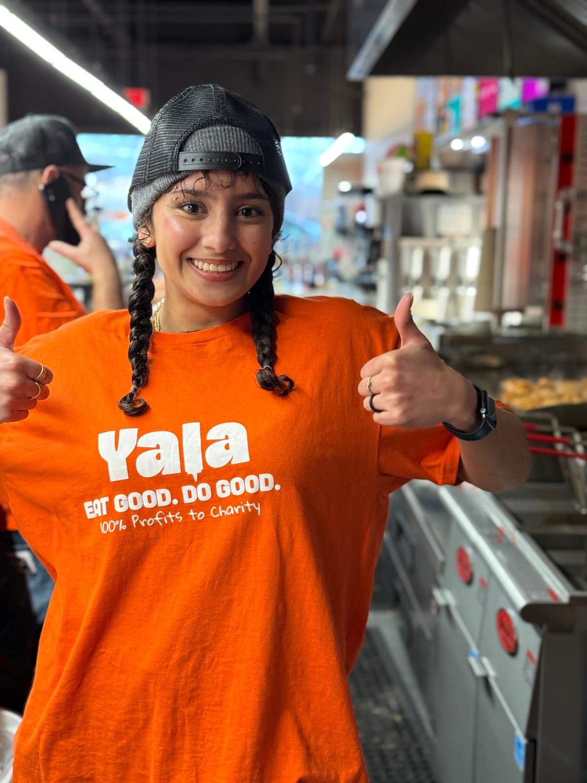
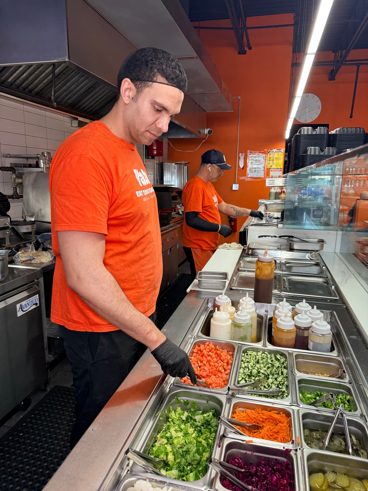
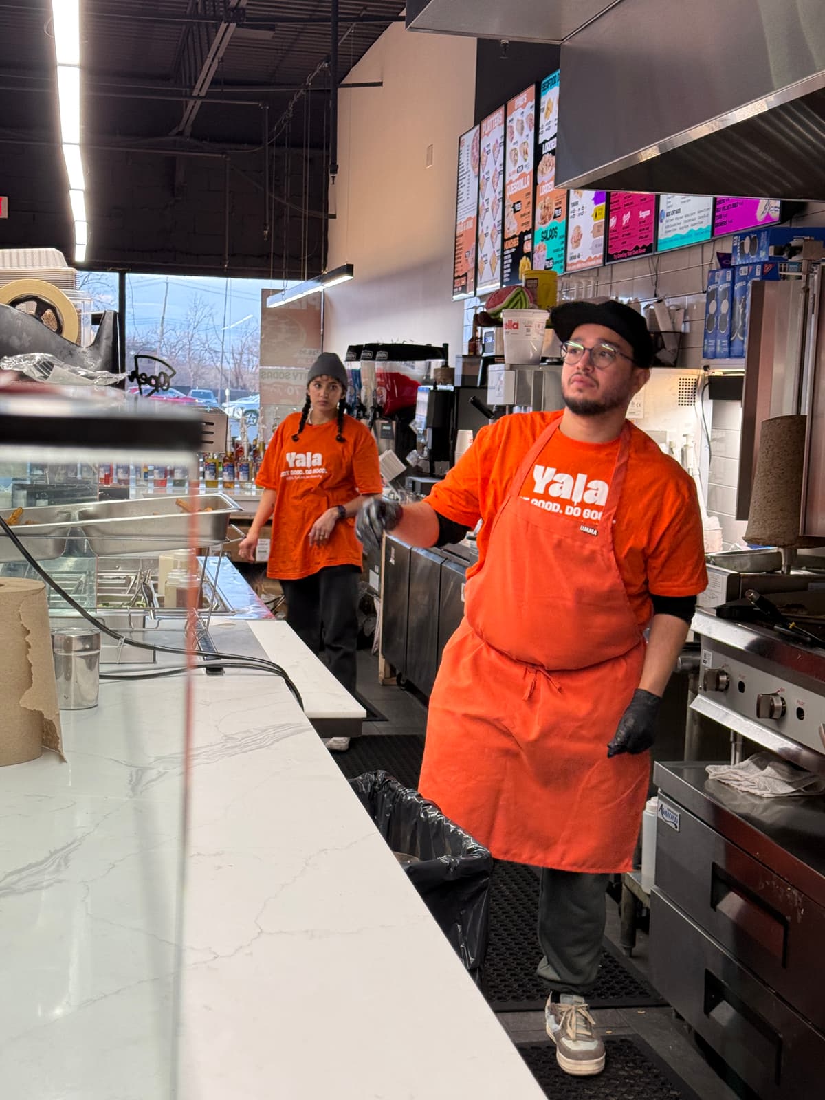
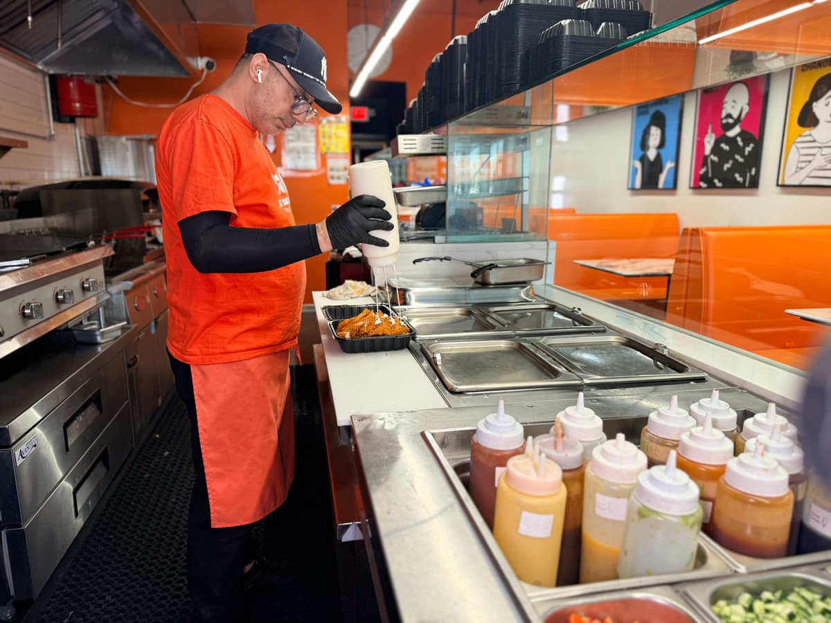
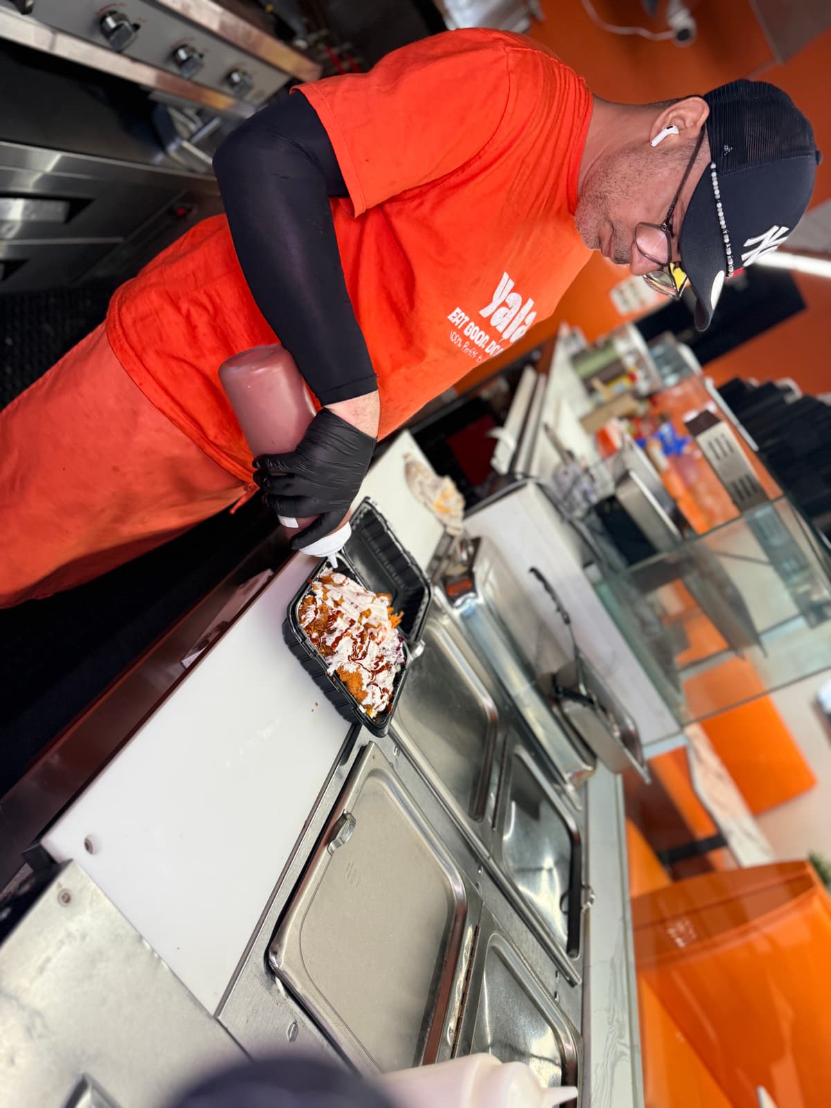
Staff Apparel
Staff uniforms are a walking brand touchpoint. Every team member should look clean, consistent, and recognizably Yala. Two uniform sets are used - front-of-house crew and grill team.
Front-of-House Crew
- - Orange crew t-shirt (#FD671D)
- - "Yala EAT GOOD. DO GOOD." on front
- - "100% Profits to Charity" tagline below logo
- - Orange apron over the shirt
- - Black gloves during food prep
Grill Team
- - Black crew t-shirt
- - Yala branding printed on the back
- - Orange apron over the black shirt
- - Black gloves during food handling
Front-of-House Uniform
Orange Apron
Grill Team Uniform
Black grill shirt photos coming soon
Add photos showing black shirt (front + back with Yala branding) + orange apron
Uniform Standards
- - Shirt clean and wrinkle-free at all times
- - Apron tied securely - no loose strings
- - Black gloves worn during all food contact
- - Grill team wears black shirt, FOH wears orange
Avoid
- - Wearing personal clothing over or under the shirt visibly
- - Mixing grill and FOH uniforms
- - Dirty or stained aprons during service
- - Any non-brand logo visible on the uniform